Eye Blink Difficulties and "Poisonous" Sounds
Today is the final day before the project is due. We found out that splitting up the scenes, like how we did with the storyboard, would not work. We I sent the clips to other group members and they pieced them together and sent them back, they were blurry and needed to be discarded. I suggested that I should be the one to edit, while they chose was sound, filter, and font would go in the opening sequence. I spent two days editing and placing all the scenes and clips into iMovie on my laptop. The first thing I focused on was trimming the scenes to get it to fit in the 2 minute time frame. This was a difficult process since majority of our scenes went over the time it had. When filming, we forgot to time each section and free styled it. Even though we planned on doing it, we forgot to execute it. However, we made due with what we had and made jump cuts in between long clips. This also fit with the thriller genre and feeling of the opening sequence. I then reviewed my previous research of different editing techniques that I had originally shared with my group. When looking at how to produce an eye blink in the software, I realized that the editing software the video was using was not the same as iMovie. I then had to further research and have trial and error with this portion. However, I figured out a filter and transition that best showed a point of view eye blink from the character. Next, I asked my group what filter would fit best with the film and they chose the iMovie filter, called "Camo", for when the setting was in the house. This filter sucked out the color of the film and made it more dreary or grey. This was crucial to show how horrible life is inside the house compared to what outside is. When the scenes were outside the house, I did not use a specific filter. I brought up the vibrancies and brightness of the scene to make the grass, trees, and sky look "happy". I then imported the royalty free suspenseful music called Venomous and Poisonous from the website Fesliyan Studios. I adjusted the volume of the sounds by lowering them when people were talking and raising it when there was no dialogue. I made sure to fade them in and out so that there was a smooth transition. The final task I did was type the names and titles of different positions and people into the opening sequence, leaving "Directed by..." for last. We discussed what font and color the title of the movie should be. It was between a type writing font and a penmanship type of font, which decided on the more graceful one for the title and the type writer one for the other titles. After this, I saved the opening sequence and published it to YouTube so that I could embed it into my next blog.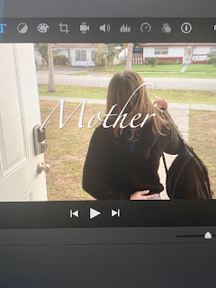


Comments
Post a Comment